Roland Switchers: Tips to Improve Text Readability with Luma Key
LUMA KEY OVERVIEW
The Luma Key is a great tool for overlaying text on your video. While we have plenty of guides that cover the basics for configuring both Luma and Chroma key across our video product lines, this advanced guide focuses on a trick to help separate white text from brighter backgrounds.
If you just overlay white text in the lower third of the screen, it will be readable until the background video has white (or bright) elements in it. And you can't put a black outline around the text characters, because the luma key will remove that black outline and may make the text look worse than without an outline.
In the following examples, I use gray shapes underneath the text to help create a semi-transparent box that helps separate the white text from the background video and improve readability.
THREE EXAMPLES
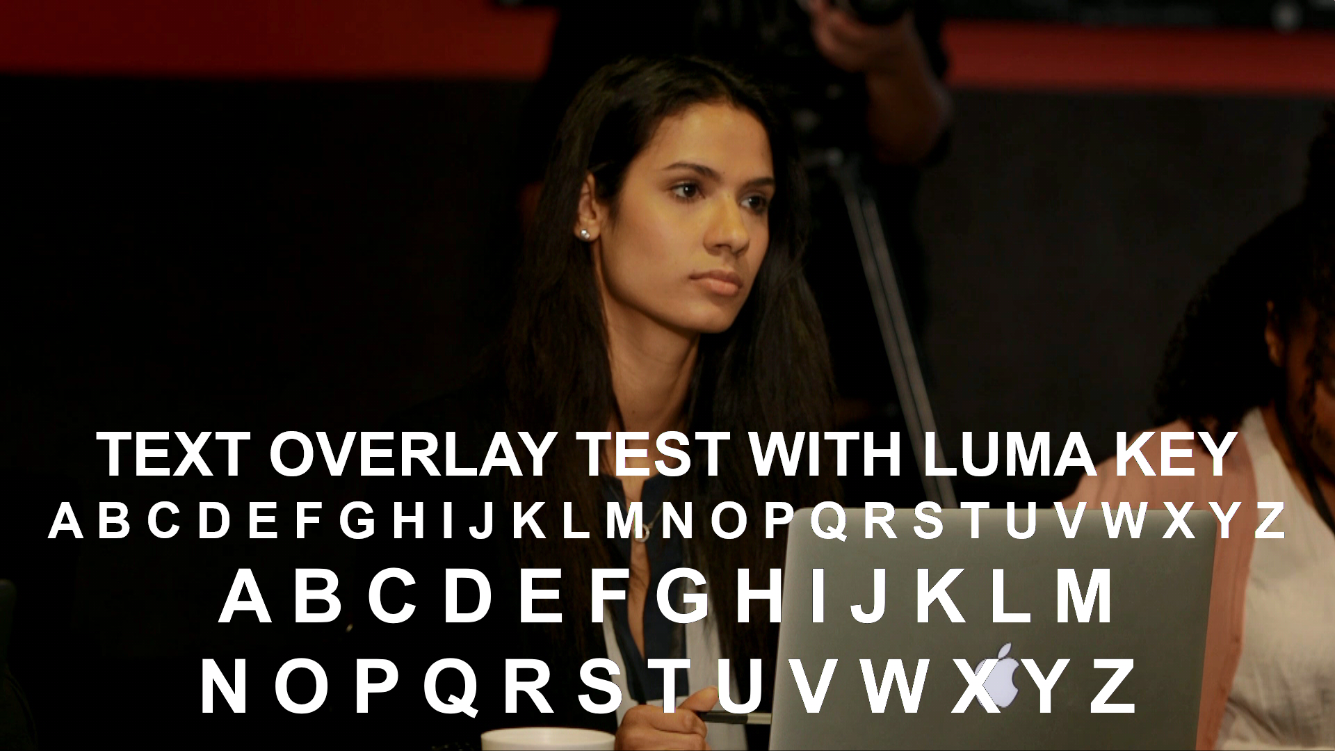
This example does not have a gray box, so it's just text being overlaid:

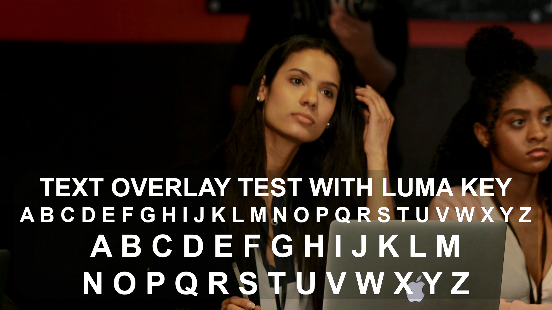
This next example has a dark gray box, where the recommended level and gain settings in this article made the gray box transparent within the switcher, and not the graphics software:

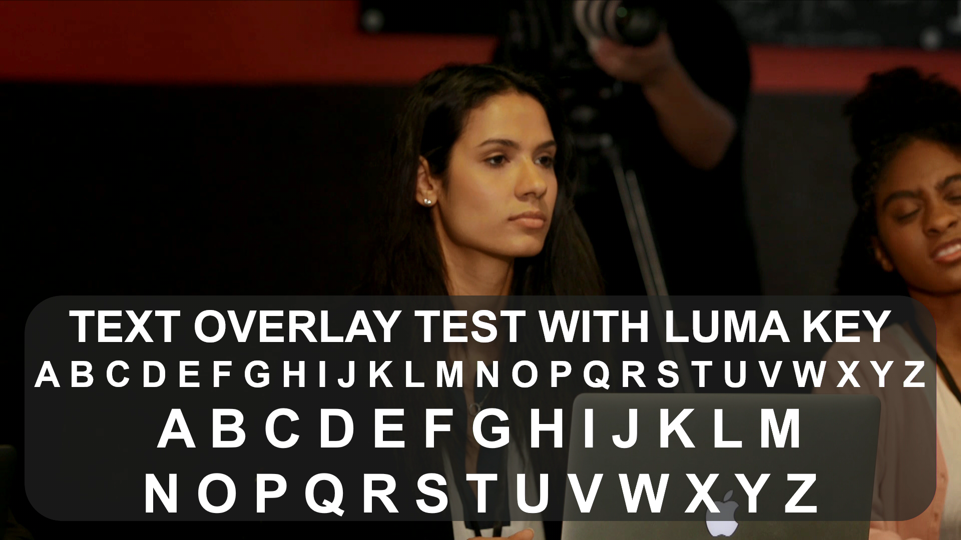
And finally, this is a medium gray box, so it is more prominent with the same keyer settings. You also have more flexibility to adjust the box's transparency using the gain control, more on that below:

RECOMMENDED SETTINGS
The lighter the gray box, the more prominent it is with these key settings:
- Key Type: Luminance - Black
- Key Level: 20 to 30
- Key Gain: 0 to 50
- Mix Level: 255
Note that these settings are a starting point and it helps to experiment with these settings to understand the relationship between the Key Level and Gain settings.
By balancing level and gain setting around those values, you can dial in the transparency for the gray box without affecting the text, but less is more, it helps to choose a shade of gray that requires minimal adjustment of the switcher's keyer settings.
ADDITIONAL TIPS
If you do not have a gray box with these settings, you may see a thin black outline on some of the text characters. If you increased the Key Level to 200, the thin outline will disappear, but you also will not see any gray boxes with the Key Level that high.
You can also turn Key Gain all the way down and have the box be a solid gray (or other) color.
If your background video's white areas are too bright in general and still causing issues, consider adjusting lighting or changing the camera's gain or iris, rather than having the switcher process the input brightness.
Finally, avoid serif fonts, as these can be difficult to key with their detailed characters. The above examples use Arial, which is an easy to read sans-serif font. Times New Roman will be both harder to read and to key because of the detailed extension (aka serif) of the strokes that form the characters:

